In January, we launched Feedbackly 3.0, which brought our customers many powerful new features. We have been actively listening to feedback and improving the features launched. One of the latest updates that we are excited to bring to you relates to website widgets.
Before checking out what’s new, let’s take a quick look at what a website widget is. If you are already familiar with website widgets, just scroll down to the section “What Is New.”
What Is a Website Widget?
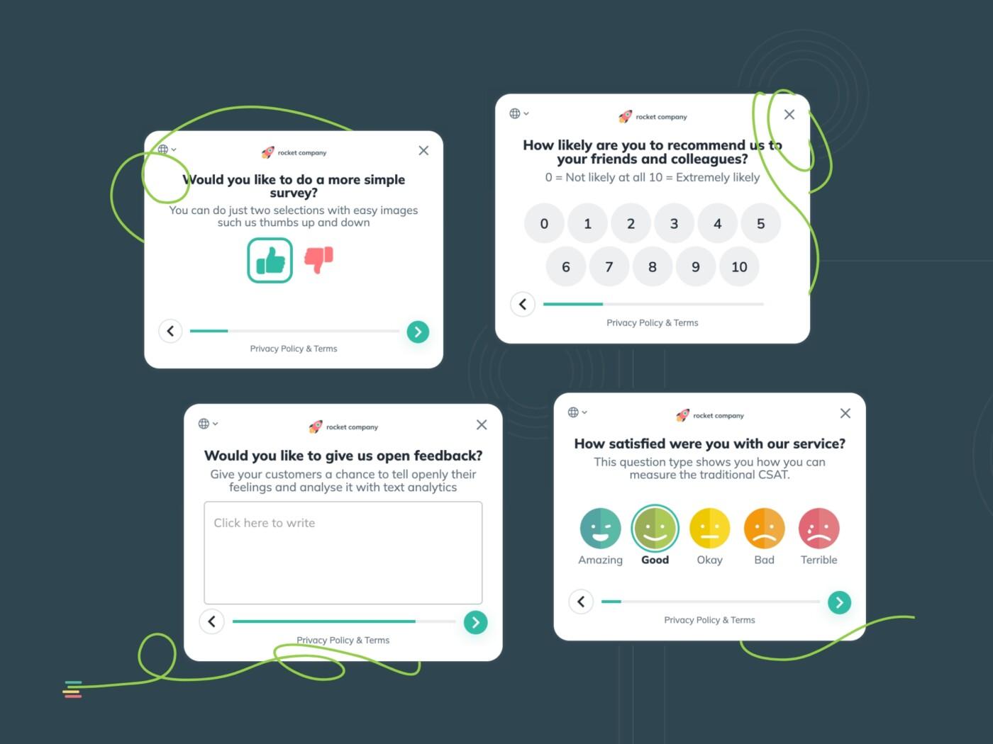
A website widget is a digital touchpoint where surveys are launched on a website using a survey window. The survey window can be a corner popup window, a popover window, or an embedded window.
A corner popup window is a small window that opens in the chosen corner of your website page. See an example here.
A popover window is a window that opens in the center of the screen on top of your website page. See an example here.
An embedded window is a window that can be embedded inside your website page between other content on the page. See an example here.
All these website widgets are added to a website using a script that you can find on your Feedbackly dashboard. You can simply copy and paste the script and add it to your website via your CMS or using Google Tag Manager. No coding is needed!
What Is New?
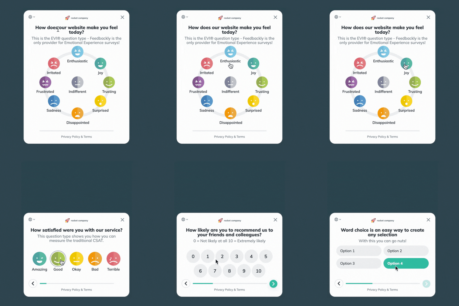
In addition to the small improvements continuously made to the usability and look of all the widgets, I would like to highlight the latest update to the website corner widget. One of the main challenges of the corner widget is finding the balance between making it as small as possible to avoid annoying website visitors while making it as big as needed to make giving feedback comfortable.
When launching Feedbackly 3.0 earlier this year, we introduced smaller website widgets. After listening to feedback from our customers, we have made the corner widget content slightly bigger while keeping the overall size of the widget the same.
Sounds like a small thing? Small yet impactful! With the recent updates, the corner window remains as small as possible to avoid any potential annoyance, but giving feedback is now more comfortable. Here is a short example:

This update is based on feedback, so your input matters! Test it out yourself and let us know what you think. Does it feel good? What should we update next?
Where Can I Test The Website Widgets?
Try out all the website widgets (and other touchpoints) on our demo surveys page here.
How do you like the website widgets? What could we improve next? Let us know via chat or give your feedback to your Success Manager.
We hope you like it!


